 / Canada
/ Canada
/ Canada
huddlie is a keepsake app for the years a child pours into what they love: the hockey season, the dance recital, the first belt. We gave the startup its mark, its colours and its voice, then designed the app screen by screen so their developers only have to build it.
Where it started
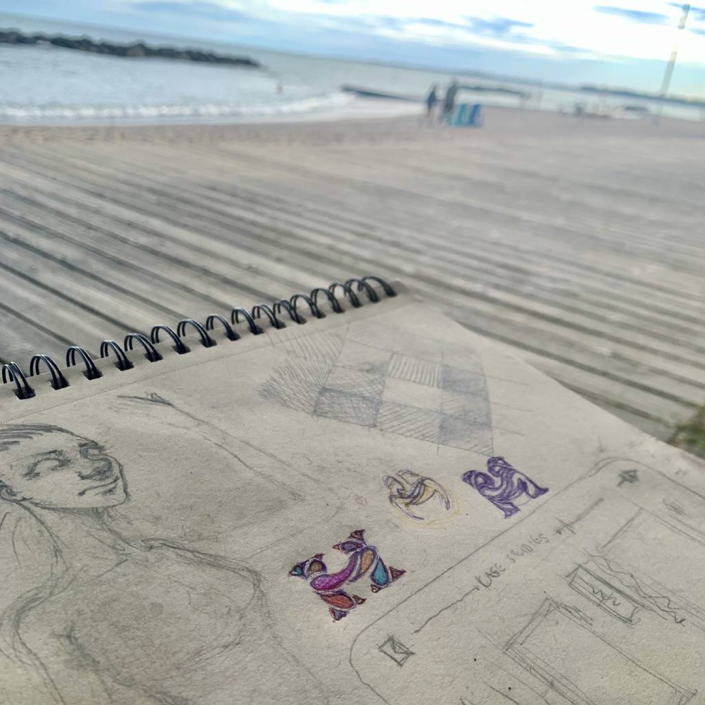
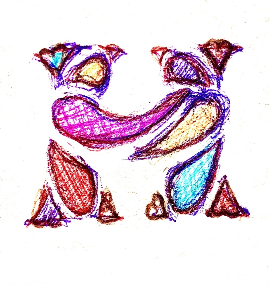
No generator, no stock icon. The mark was drawn by hand first: two people huddling, their bodies forming an H, their arms locked into its crossbar. Everything in the app grew from that page.
01 · The sketchbook
The first H, drawn among other studies on a sketchbook page.
02 · The drawing
Two figures, a head and a body each. The arms interlock into the crossbar, with small hearts at their feet.
03 · The mark
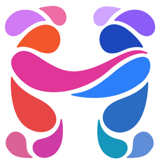
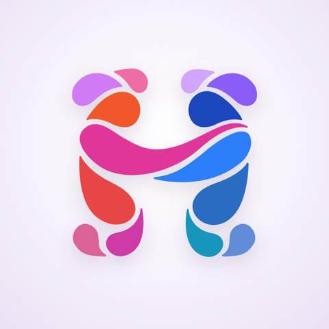
Redrawn as 14 shapes, with a speech bubble over each head. In the app it forms piece by piece, then the two halves lean in and hug.
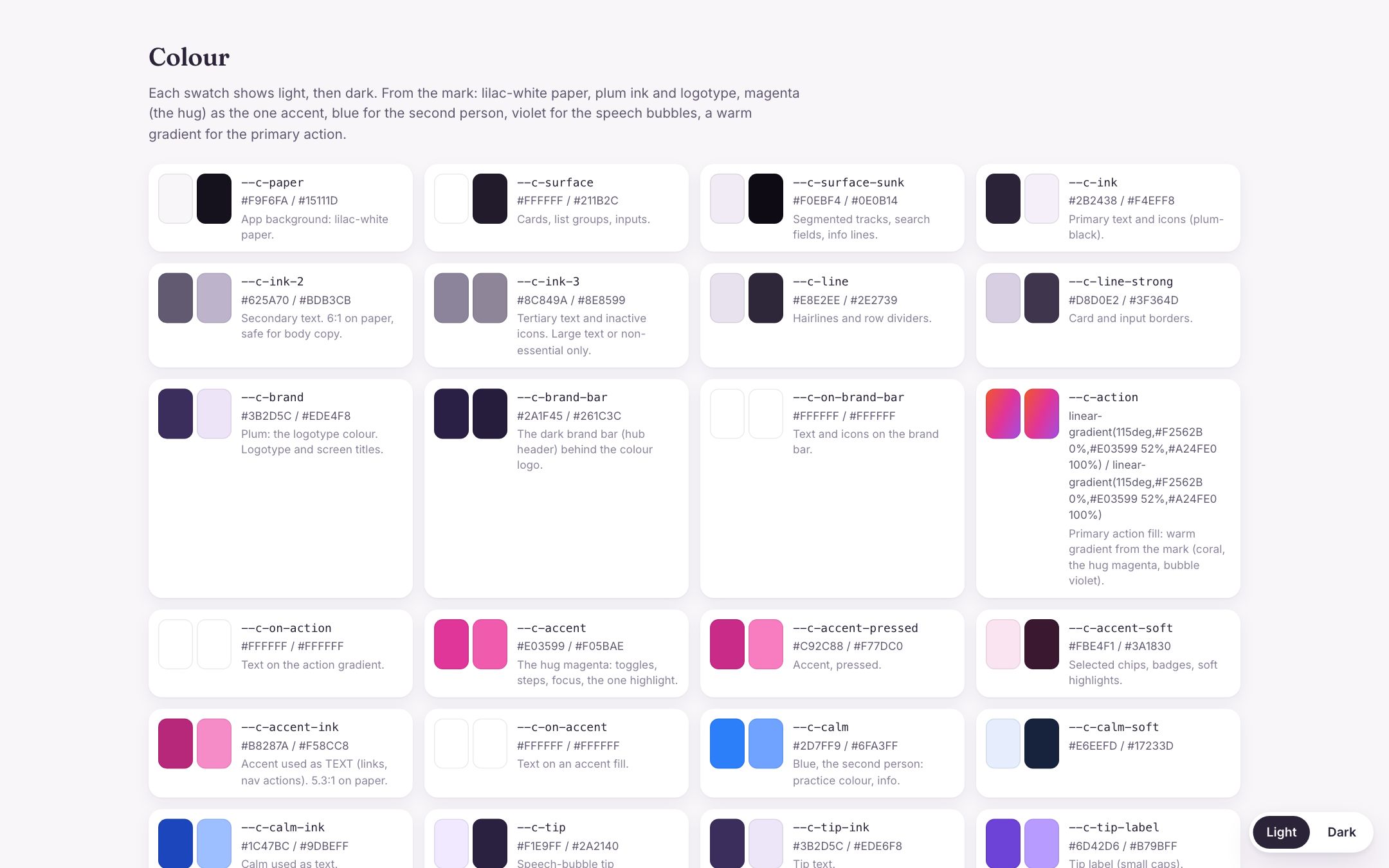
The colours come from the mark itself
Live. Tap through it right here.
01The app
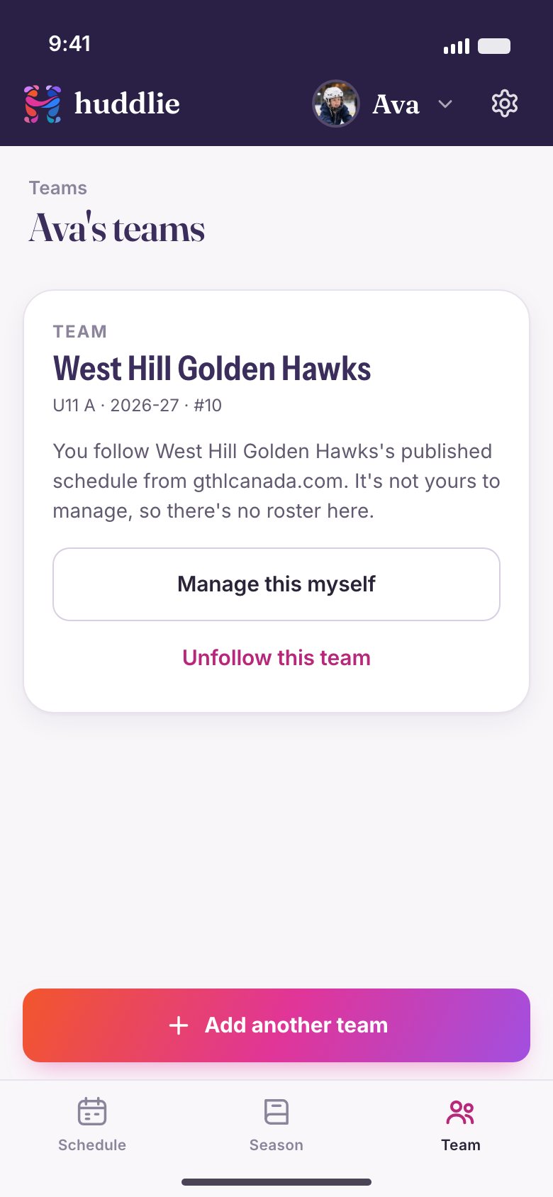
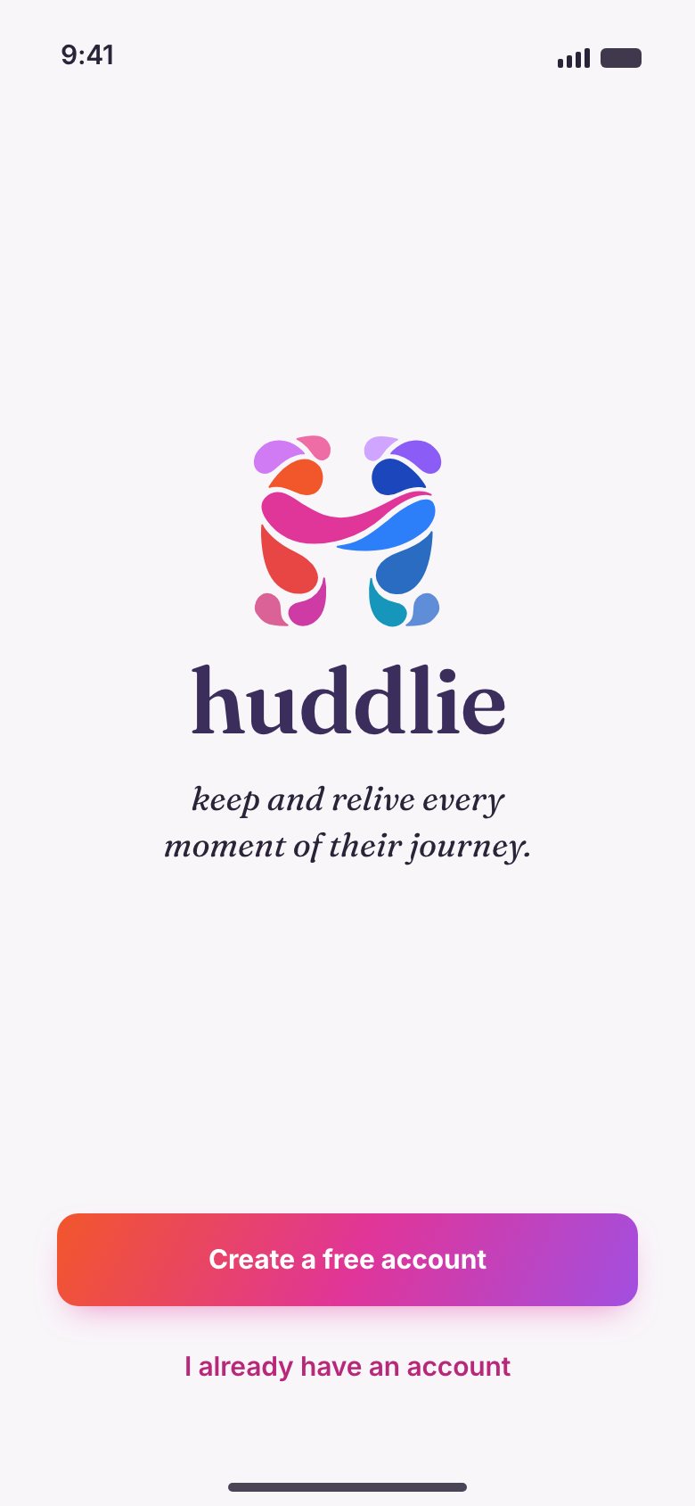
The whole experience was built as a clickable prototype first, so the founders could hold it, argue with it and hand it round before a line of production code existed.


02The kit
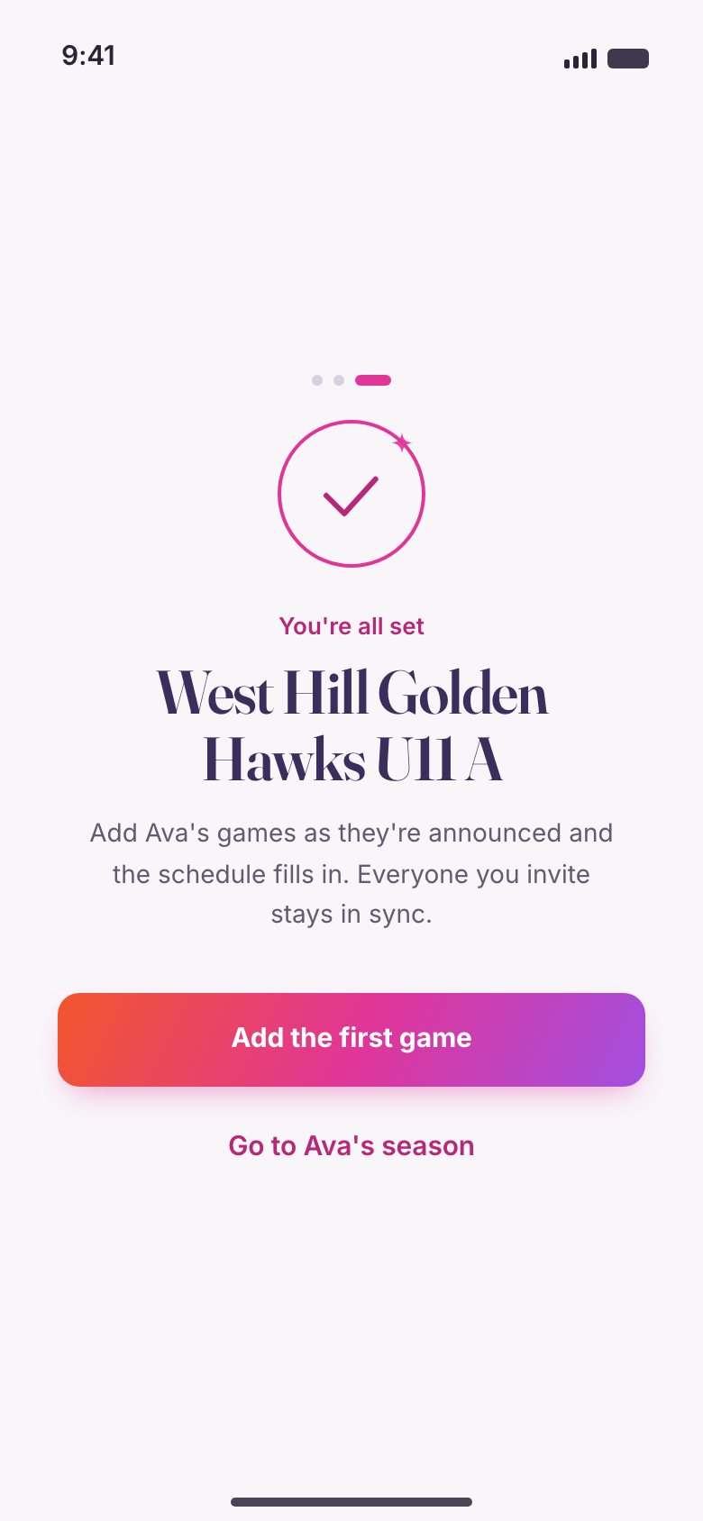
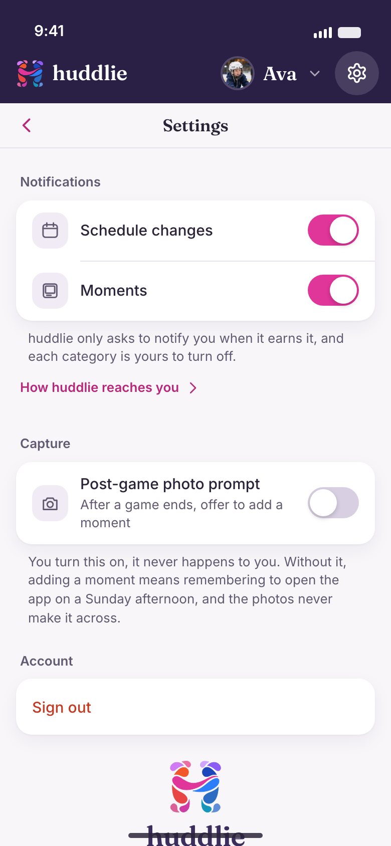
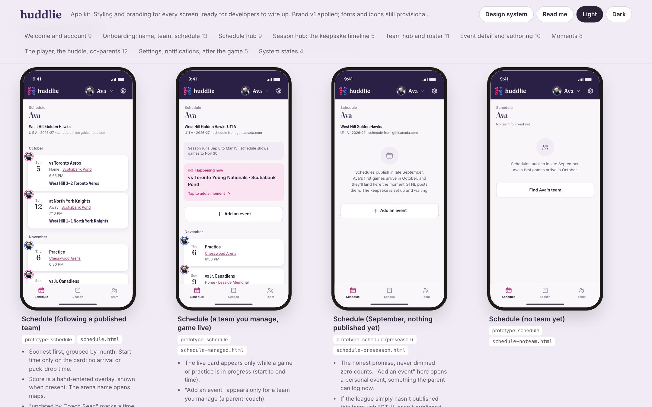
The prototype proves the flow. The kit is what the developers build from: every screen drawn as its own file, with the behaviour written underneath it. The loading, offline, error and empty states are there too, because a shipping app needs them and a pitch deck never shows them.
03The design system
Every colour, type role, space and curve lives in one tokens file, in light and dark. Developers map it once into Swift, Kotlin, React Native or Flutter and build against the names, never the raw values. Change the brand later and the screens follow.
Three voices
Ava's season
Fraunces · names, titles, dates. The keepsake voice.
West Hill Golden Hawks
Instrument Sans at 85% width · team names and scores
Add a moment, invite the huddle, follow the team.
Inter · everything you operate
The app icon
Drawn avatars



For startups building an app
Most early apps ship on a template and try to find a face later. huddlie started with one. Here is what a founder gets when we work this way.
A mark, logotype and palette made by hand, with the motion that brings them to life on launch.
The full flow, clickable on a real phone, so decisions get made before they get expensive.
Each screen and state as its own file with its behaviour written down, including the ones pitch decks skip.
Tokens, type, icons and components your team imports once and builds against for years.
Building an app?
Tell us what you are building and where you are with it. We'll bring the brand, the screens and 25 years of judgement.