

 / Canada
/ Canada
/ Canada
A new high-end clinic in Dubai came to us with a problem most brands never have: three businesses under one roof. Medical operations, beauty treatments, and a relaxation space for retreats after surgery or simply time for self-care. We gave the clinic its name, its mark, its colours and its uniforms, and a colour system that keeps the three apart without splitting the brand.
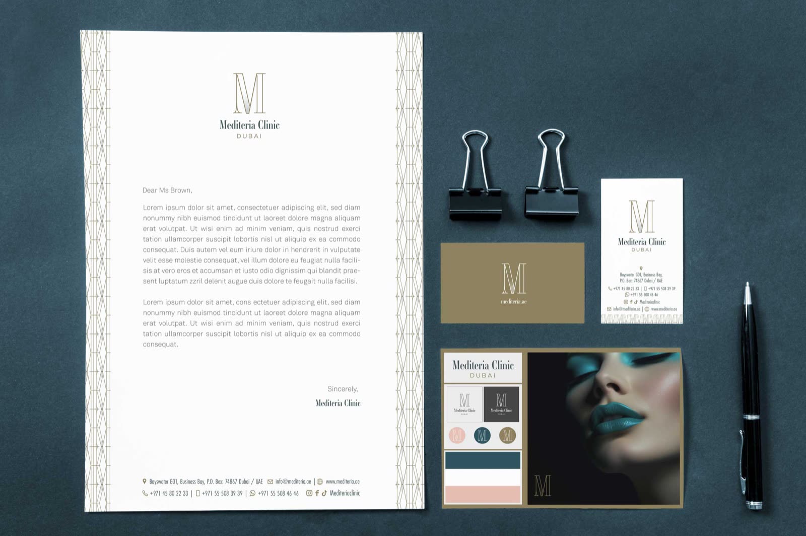
Where it ends up. The story of how it got there follows.
The problem
A patient booked for an operation wants to feel they are in expert hands. A client booked for a beauty treatment wants precision and a little glamour. A guest in Relaxation, recovering after a procedure or simply taking time for themselves, wants to slow down. Put all three behind one generic clinic look and something gives: the medical side feels less serious, or the retreat feels like a waiting room.
These are high-end clients, and they notice. So the brief was two things at once: one clinic people trust, and three spaces they can tell apart at a glance. Colour would have to do most of that work.
MedicalCosmeticRelaxation
Step 1 · The name and the mark
Everything hangs on the name, so it came first. Mediteria is Mediterranean and medical in one word. Mediterranean brings the warmth, light and ease that high-end clients in Dubai associate with it; medical brings the expertise. Together they make a name no other clinic has, one that sounds professional in a consultation and still inviting at a spa retreat.
The mark is a tall, fine-lined M in gold, with a narrow serif wordmark and DUBAI spaced out beneath it. It holds its own on dark paper as well as light, which is where a clinic's first impression is made: on the card in a patient's hand.


Step 2 · The colours
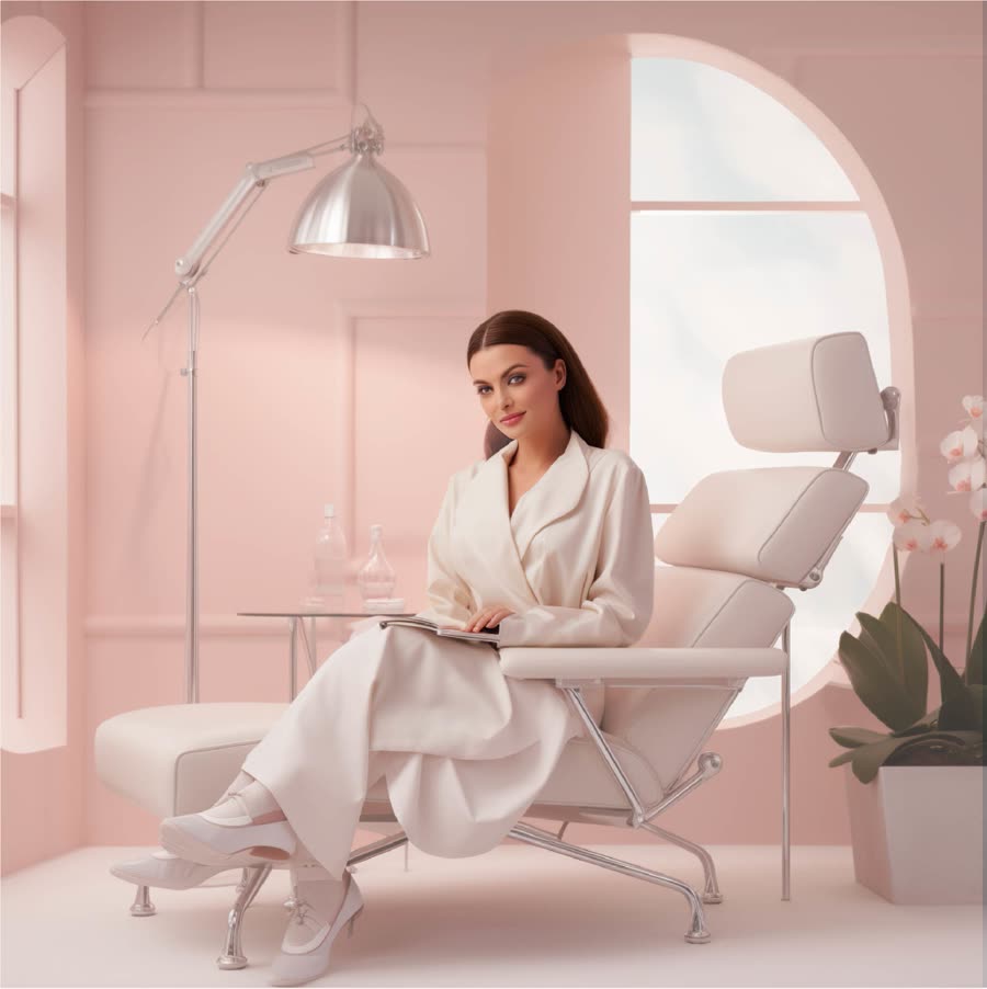
This is where the problem gets solved. Each division gets its own ground, chosen for the mood its clients come for: deep teal for Medical, where people need to feel safe; ivory for Cosmetic, clean and precise; blush for Relaxation, where recovery and self-care should feel soft. The gold of the M runs through all three, so they never stop being one clinic. On blush the gold line turns white, the softest the system gets.
#85754EThe M, and the line that runs through the patterns.#174350Medical. Operations, and the calm of expert hands.#FCFAF9Cosmetic. Beauty treatments: clean, bright, precise.#E7BBAERelaxation. Recovery and self-care: the softest the system gets.#34484BThe wordmark, and every line of type.Step 3 · The pattern
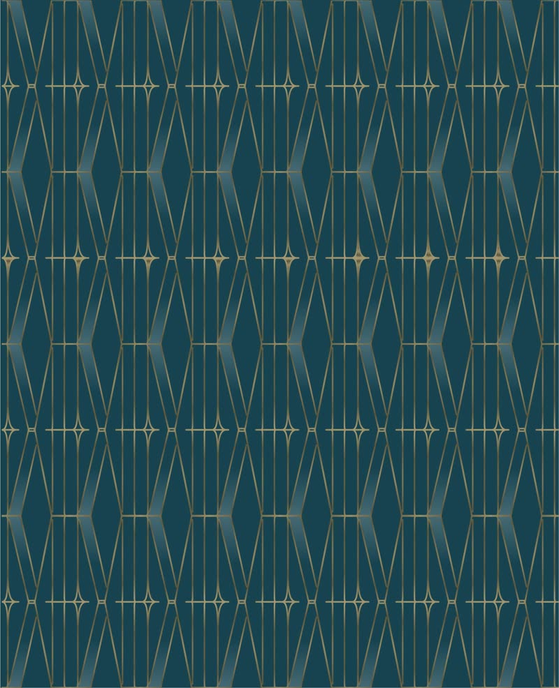
A single geometric pattern, a lattice of tall, fine-lined diamonds drawn in the same hand as the M, is recoloured for each division. Change the ground and the same drawing goes from clinical to calm. Nothing new to learn, nothing that looks like another company.


Step 4 · The divisions
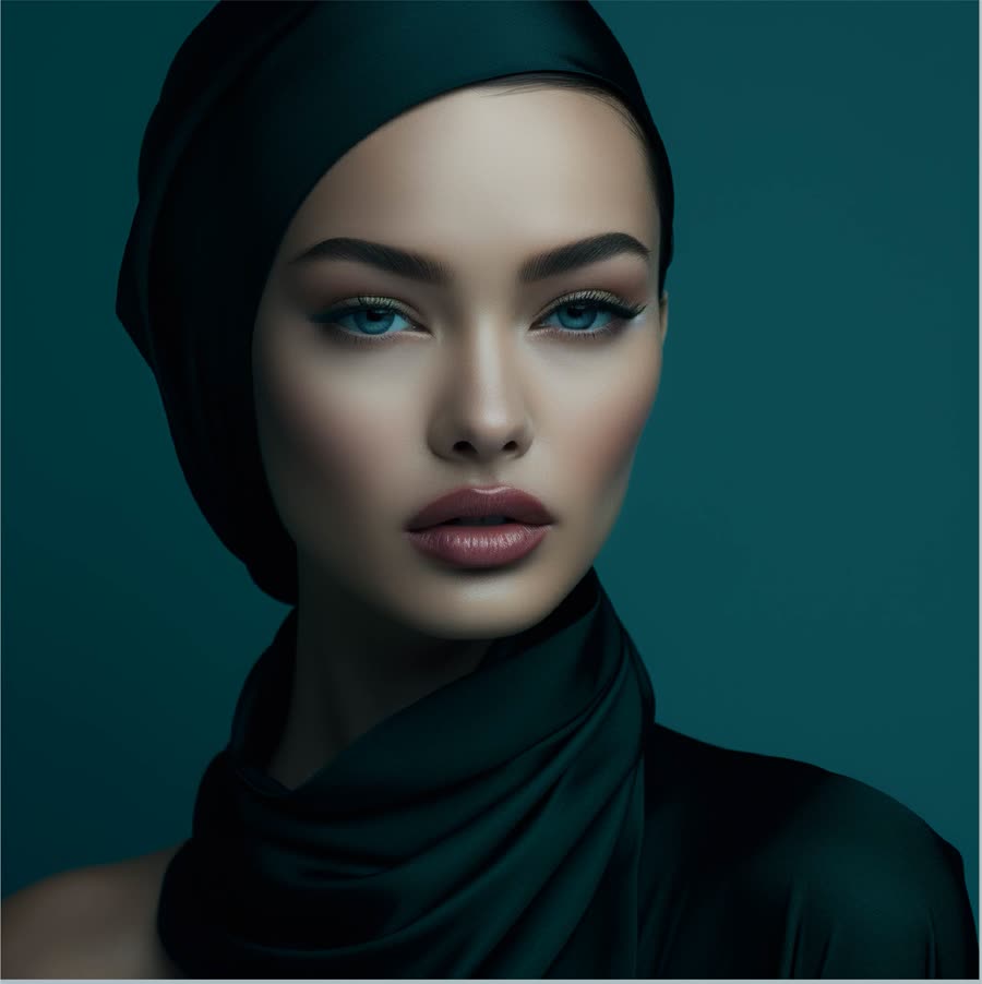
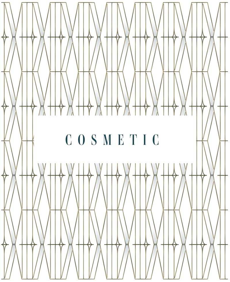
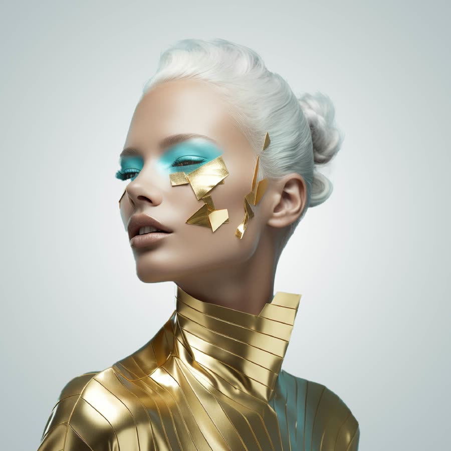
Each division signs off the same way: its name in a quiet label, set on its own colourway of the pattern. Then each got a mood of its own. We built the moodboards with AI to set the art direction for photography and social before a single shoot was booked.


Step 5 · The uniforms
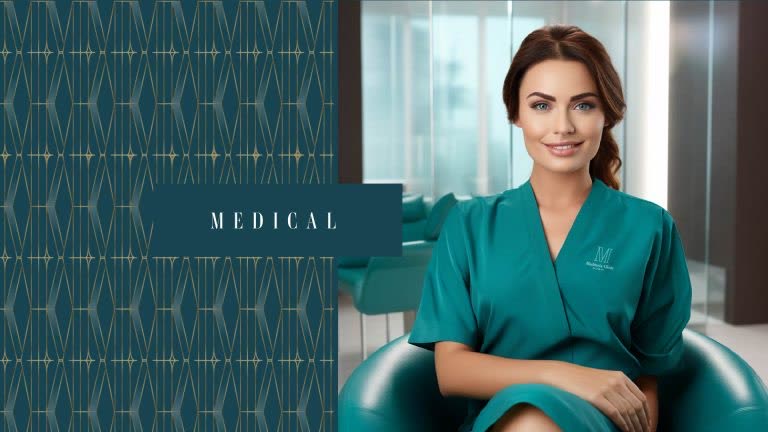
Uniforms are the part of a brand patients meet face to face. The clinical team wears teal scrubs with the M on the chest, taken from the Medical ground, so staff read as part of the space they work in and the mark is on every conversation.


Uniform visualizations.
Put together
Stationery, print and social all draw from the same few parts: the M, the gold line and the three grounds. A patient moving from a consultation to a treatment room changes mood, never brand.


Opening a clinic?
Name it, give it a face and make every division feel like the same place. Tell us about your practice.