


Their guidelines said the orange was for accents. A person reads that and understands. An agent reads it and asks how much orange counts as an accent. So we wrote the rule as a number, put a script behind it, and made the document a person reads and the file an agent loads come out of the same source.
The problem with a beautiful PDF
Brand guidelines were invented for an audience that could be trusted to use judgement. You wrote "generous white space" and a designer knew what you meant. That assumption held for fifty years.
It stops holding the moment the person making a slide at 11pm is not a designer, and the thing making the slide is not a person. An agent cannot infer. It will either find a rule it can act on, or it will invent one, and the invented one will look almost right, which is worse than looking wrong.
Miller Advisors had the same setup most companies have: a verbal identity and a logo set from the studio that created the mark, and then a widening pile of real work built on top of it. Decks, email signatures, newsletters, business cards, a website. Every new piece was another chance for the system to drift a little.
One source, two deliverables
The fix was not a better PDF. It was to stop writing the rules twice.
Every value in the Miller Advisors system now lives in one source file. From it we generate two things: a brand book a designer reads, and a brand skill an AI agent loads. Same colours, same limits, same refusals, because they come from the same place. When the source changes, both change in the same build. They cannot drift apart, because there is nothing to drift from.
The skill ships in the Agent Skills format, as a folder of plain Markdown and JSON with small Python scripts beside it. It runs in Claude Code and in any agent that supports the format. Nothing is compiled and nothing phones home.
What is in the package
- 15logo masters, placed only, never redrawn or recoloured
- 12approved colours, with contrast computed rather than typed
- 8two colour icons on one 512 grid, orange on the part that carries the meaning
- 1tiling pattern built from the monogram, in two colourways
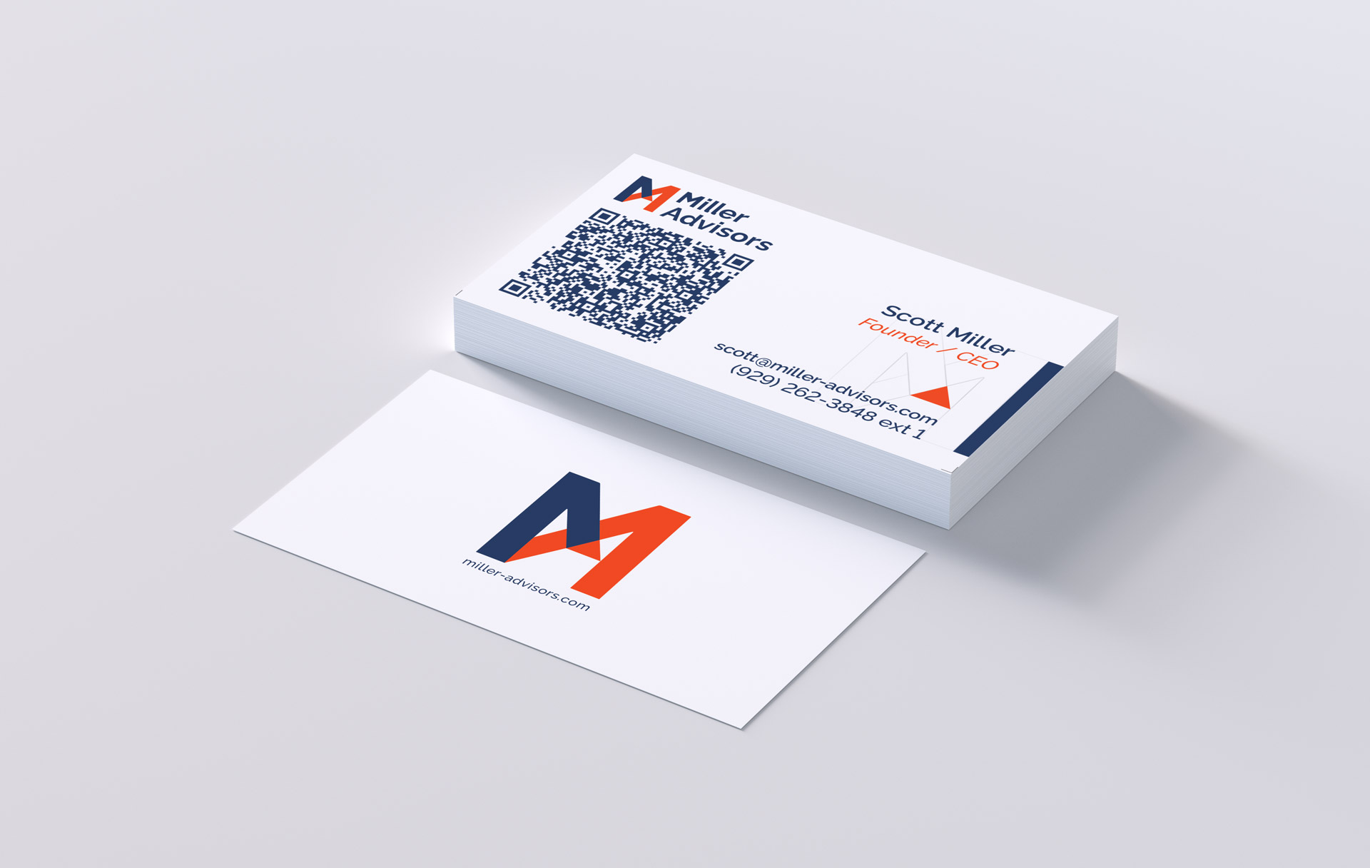
- 2press ready business card PDFs, CMYK with spot separations
- 2fillable templates: an approved email signature and a social post still in draft
Raleway carries the whole system, bundled under the SIL Open Font License with its licence file, so the client can redistribute it without asking anyone. The typeface check names the fallback it used rather than substituting one quietly.
Rules that refuse
The interesting part of a brand skill is not what it makes. It is what it declines to make.
Ask it to turn the logo red for a holiday card and it does not. It explains that the logo is only ever placed from the master files, lists the approved versions, and gives you the studio's contact. Ask for a signature whose name is too long for the approved layout and it shrinks the text to the minimum the designer set, then tells you it did. Go past that minimum and it stops, and no file is written.
Those messages are fixed wording, not paraphrase, and they appear in the agent's reply rather than printed on the artwork. Two levels only: a note means it went ahead and here is what changed, a stop means it did not and here is why.
Where no template exists yet, for a poster or a flyer, it builds from the core rules, saves its review notes in a separate file beside the artwork, and recommends a professionally designed template rather than pretending the result is one.
Tested before it shipped
A rule nobody tested is a wish. Every release passes three layers before it leaves the studio.
The package check runs on every build: 19 checks passed, 5 raised warnings, none failed. It recomputes contrast from the hex values instead of trusting the table, confirms every file named in the rules exists, verifies no script in the package can open a network connection including the vendored QR library, and blocks any other studio's contact details from appearing anywhere in the kit.
The behaviour tests run scripted requests through a real agent and check the actual output, including that every note and stop came back word for word rather than politely reworded. Eleven of eleven passed on Claude Code running claude-sonnet-5.
The third layer is a human looking at the results, which is the one that cannot be automated and should not be.
A SHA-256 fingerprint of every core file ships with the package. If a rule file is edited outside the studio, the setup check names the changed file, so a modified rule is never mistaken for the approved brand.
What is still open
Version 0.1.0 is the first release, not the finished article, and the documents say so on their own pages. The social post template is a draft and marks anything it produces as a preview. The image direction is written in words with no approved reference set yet. Values the client has not confirmed, including two Pantone references, are labelled as unpublished rather than guessed at.
That labelling is the point. A brand system that hides its gaps teaches an agent to fill them.