

 / Canada
/ Canada
/ Canada
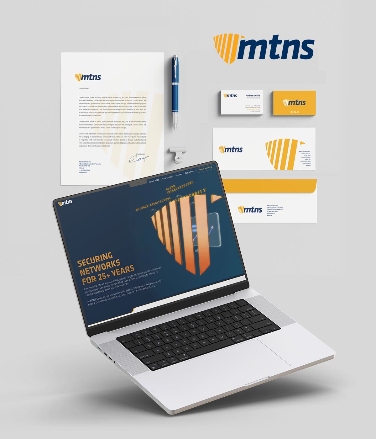
MTNS Solutions designs, builds and manages networks for enterprise clients from Toronto. We gave the company its corporate identity and then its website. The founder credits us with creating both the brand and its digital home.
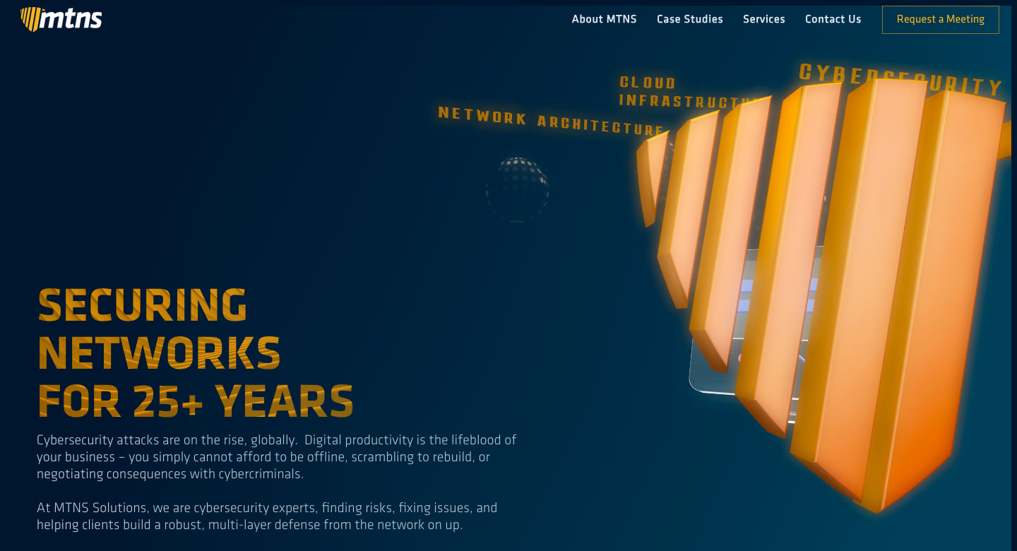
mtns.ca as it runs today, captured 2026-09-30.
The mark
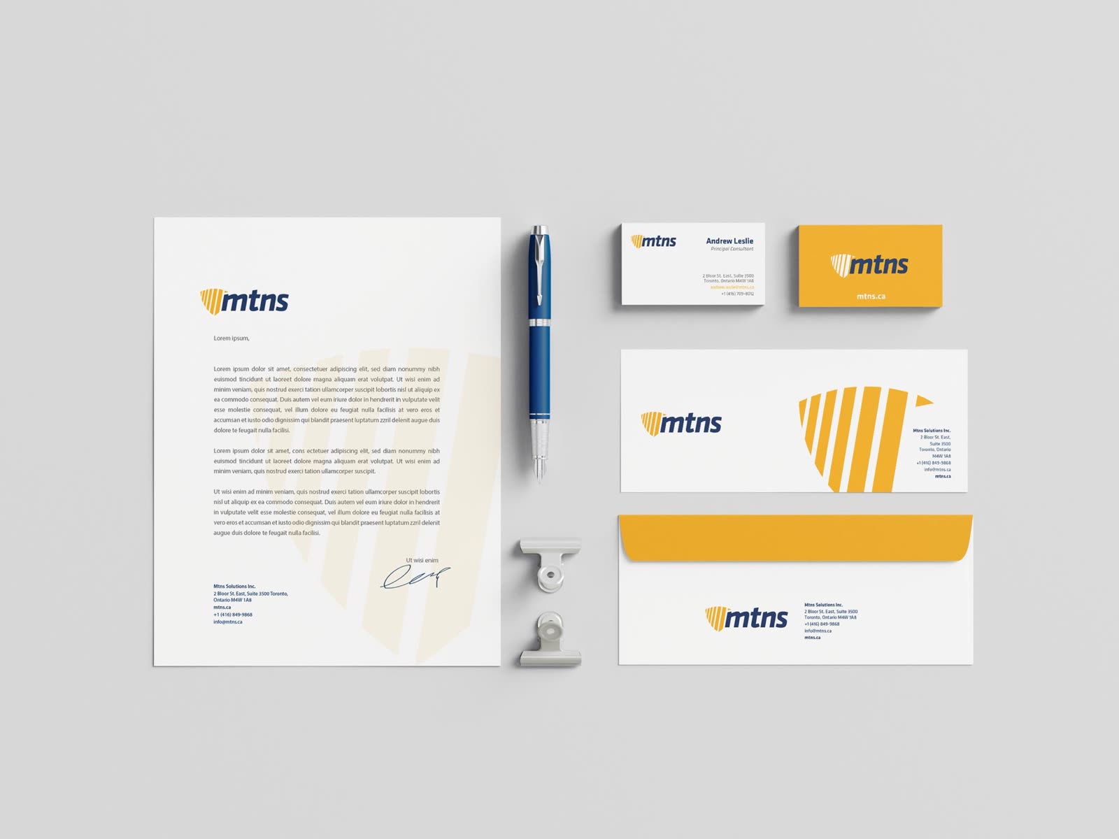
The mark is a shield built from vertical bars, set beside a heavy italic wordmark in navy. It reads as protection at a glance, and the bars work on their own wherever the full logo won't fit: as a watermark on the letterhead, or large across an envelope.

The system
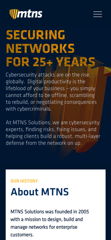
Navy and a warm amber carry every piece, from the business cards to the website. On the site the shield becomes a three-dimensional object that the headline sits beside, and the same palette holds on a phone.
Selling expertise?
A clear identity tells a buyer you are serious before they read a word. Tell us about your company and where it's going.